« previous: Amazing | next: Witticisms »
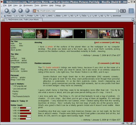
New Theme
I’m designing a website for my sister’s real estate appraisal business, so I got the theme bug, and had to make a new one for my site. After having it online for nearly a day, I discovered a bug in Internet Explorer (surprise...) whereby instead of using the color that I specify for links (red), it picks a color from a commented-out section of my stylesheet and uses that instead (blue). It’s fixed now.
Anyway this theme is awesome. If it doesn’t look awesome to you, then your browser/computer/eyes are broken. Also, if you have your browser set to some obnoxiously large font, then it might not look as awesome. Here’s a screenshot of the way it ought to look:

I’m not sure about the link color, though. I like it, but I’m not sure if it contrasts enough with the black of the normal text. For example, does this link stand out enough? Can you even tell it’s a link?
Also, it wasn’t meant to be a Christmas theme, what with the red and green and all. The red was intentional, but then I was thinking maybe a grayish color for the interior, and just guessing, I typed in a7bf92, and it turned out to be a pale green. I like it so I kept it.
I’ll bring back the switch-the-theme links once I come up with a place to put them. I want to put the random quotes back too, but I think they will clutter up the top of the page.
Comments:
Reply to this message here:
Home – Create Post – Archives – Login – CMS by Encodable