« previous: Baby got ..... Bible? | next: Firefox »
Nit-picking
On the "Recent Discussion" list, is the reply-count a useful feature?
...ok, now be honest: how many people had no idea that the mysterious unlabeled number was in fact the reply-count?
Comments:
The reply count was indeed useful. I actually _did_ understand that the ’unlabeled’ number was the reply count. Did somebody ask you about it? Was the (2) for example not obvious enough? When you’d click the link under recent discussions, you’re brought to the post which magically has the same number of replies as listed in the parentheses. I thought that was more than adequate, but maybe to idiot-proof it, instead of having the new: "#2 - date - time" format you could write "x replies - date - time" where the replies > 1, "1 reply - etc" where the number of replies = 1, and "No replies yet - etc" when nobody has written a reply yet. OK this post is long enough. (:
Well, I knew it was there and knew what it meant but I think it’s overkill since the reply count is already listed above each post. OK?
Still lvu,
Well, at least my mom still loves me.
Kim votes pro-replycount too, via phone, as does Steve via IM.
It’s true that the reply-count is redundant for posts that are currently on the main page, but older posts are not. And the recent discussion list is on every page, not just blog pages, so it’s not redundant there either. I think that’s enough to justify its continued existence.
So... the thing is, I want it less cluttered, and I can’t seem to find a good place there to stick a solitary digit. I didn’t like the old (N) format because it made the title-line too long. I could make a whole new line that says "N Replies" but I’m not sure I want each one to be 4 lines instead of 3. And I don’t want to do "N replies - date -time", again because I don’t want it that wide -- one of the driving forces here is the need to make the side columns narrow in this 3-column layout.
I’m pulling the lever for the old-school (N) format. If it ain’t broke and you fix it, I’ll cut you, sucka! You can trust me, I have a minor in Digital Arts and thus am certified by the Pennsylvania State University to dole out advice on text formatting and alignment.
Seriously though, I never noticed that the title line was too long, but I know that it’s different when it’s your site and you notice every little imperfection. So you have my sympathies in that regard. I’m sure you’ll make the right decision.
It’s not always too long; it depends on the length of the title, and on the user’s choice of text-size in their browser.
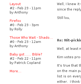
This is the size I normally browse at:

Even at this small size, adding a (0) after "Shado..." would put it directly against the content column. Or worse...

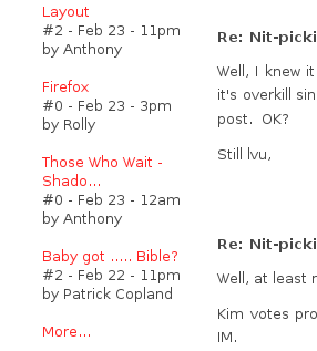
At just 1 text-size notch bigger, the title is already wrapping even without the longer line that (0) would create.
OK, I’ve changed it to "N Replies" on a line by itself. I might really like it this way. Plus, this means the date/time line is now shorter, and I can once again use "yesterday" instead of "MMM DD" for posts made yesterday, which I think is very handy and much nicer.
I think you have chosen wisely. I am biased though since you seem to have gone with ’my’ No replies/1 reply/x replies strategy. OK I won’t take full credit, you did put it on a separate line and all. Hehe. (:
Reply to this message here:
[ Home – Create Post – Archives – Login – CMS by Encodable ]